Does McDonalds make you feel ‘joyful’? Infographic reveals the Psychology of colour and how it’s used in advertising
Psychologists recently found logos are hardwired into our brains
We identify logos from the age of two, and link products in 67% of cases. Researchers from Chicago used colour psychology to study popular logos. It found Google’s green Android is associated with peace and hope. McDonald’s’ yellow arches were found to instill feelings of joy and energy. While the orange used by Fanta is synonymous with creativity
ByVictoria Woollaston
PUBLISHED: 17:07 GMT, 19 March 2014 | UPDATED: 18:18 GMT, 19 March 2014
The popularity of various logo quiz apps on phones and tablets is testament to how customers relate so much to a brand based on its logo design.
Psychologists recently found logos are so hardwired into our brains we can identify them from the age of two, and young children can link products to logos in 67 per cent of cases.
In response to this, a pair of researchers from Chicago have studied some of the world’s most popular logos and plotted how they make people feel, based on colour psychology.
Researchers from Chicago studied the associations logos and their colours have with customers and created an inforgraphic. For example, companies with green logos, including Google and Starbucks pictured, are seen as trustworthy, helpful, and relaxed
Colour psychology has been used for years to establish how different hues affect people’s emotions and mood.
Although it varies from person to person, psychologists and researchers have found some common threads. For example, blue is the most popular colour in America, followed by green, purple and red.The popularity of blue and green has been linked to nature and habitats, and may date back to a time when we lived outside.
More…
Take the ultimate selfie: Samsung launches super-thin camera with flip display – and photos are taken with a simple WINK. Is this the first wearable computer? 300-year-old Chinese abacus ring was used during the Qing Dynasty to help traders.
Colour preference can even change depending on the temperature. People who usually prefer red and orange, for example, may choose cooler colours including blue and white when they’re body temperature is higher than normal.
Traditionally, men are thought to prefer reds, oranges and yellows, while women prefer blue, greens and pinks.
Researchers discovered customers tend to make a judgment on a product within 90 seconds of seeing it, and between 62 per cent and 90 per cent of this judgement is based on colour.
Alex Hillsberg, from Financesonline.com, who conducted the research, said: ‘Some logos are so powerful that they don’t need to spell out their names, or that they transcend cultural borders.
‘Iconic logos are masters of subtleties and understatements. We know it’s not set in stone, but colours can evoke a specific emotional response from us.
‘Red means active, yellow is energetic, blue is reliable, green is nature, and so on.
Colour psychology has been used for years to establish how different hues affect people’s emotions. Traditionally, men are thought to prefer reds, oranges and yellows, pictured, while women prefer blue, greens and pinks. McDonald’s yellow arches, pictured right, are associated with joy and energy
According to Hillsberg’s infographic, the colour purple is linked to the ‘luxury of royalty’ and is used by Cabdury, but also FedEx and Yahoo, pictured
‘In fact, it doesn’t stop at the obvious; researchers at the University of Rochester in New York believe red can actually ‘keep us from performing our best on tests.’
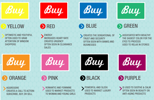
According to Hillsberg’s infographic, red is also associated with intensity and feelings of passion and aggressiveness. It is used in the YouTube and Red Bull logos.
The blue Samsung and Ford logos fill customers with feelings of trust and confidence because blue is associated with the ‘depth and stability of the sky and sea.’
McDonald’s yellow arches are associated with joy and energy, while Google’s green Android was designed to have ‘harmony of nature.’ Other green logos include Starbucks.
Psychologists from Amsterdam recently discovered logos are hardwired into our brains from the age of two, and children can link products to logos in 67% of cases. This rises to 100% in children aged 8 and over
Brown logos make companies appear dependable and reliable, in the case of UPS, pictured. Alex Hillsberg, from Financesonline.com, said: ‘Some logos are so powerful that they don’t need to spell out their names, or that they transcend cultural borders’.
Music service 7digital recently moved away from blue towards a greener logo to appeal to more customers. Spotify’s logo is similarly green.
The colour purple is linked to the ‘luxury of royalty’ and is used by Cabdury, but also FedEx and Yahoo.
Elsewhere, orange makes people feel enthusiastic and creative, perfect for brands such as Mozilla’s Firefox and Fanta.
Black, traditionally used for bold and luxurious brands, is associated with the ‘formality and mystery of the night’, pictured top. Aside from pink, pictured bottom, being associated with feminine traits, it also links to feelings of warmth, love and nurturing.
Elsewhere, orange makes people feel enthusiastic and creative, perfect for brands such as Mozilla’s Firefox and Fanta
Aside from pink being associated with feminine traits, it is also linked to feelings of warmth, love and nurturing.
Black, traditionally used for bold and luxurious brands, is associated with the ‘formality and mystery of the night’, while brown logos make companies appear dependable and reliable, in the case of UPS.
‘It’s an interesting world of logos we have here,’ continued Hillsberg.
‘Far from puny, arbitrary doodles, they are calculated, big business strategy with one thing in mind: that you remember them in your sleep.

THE PSYCHOLOGY OF COLOUR
Red: Associated with intensity, passion and aggressiveness.
Examples: YouTube and Red Bull
Blue: Associated with trust, confidence, and ‘depth and stability of the sky and sea’
Examples: Samsung and Ford
Yellow: Associated with joy and energy.
Examples: Ferrari and McDonalds
Green: Associated with the ‘harmony of nature’, relaxation and hope.
Examples: Android and Starbucks
Purple: The colour purple is linked to the ‘luxury of royalty’.
Example: by Cadbury, FedEx and Yahoo.
Orange: Associated with feelings of enthusiasm and creativity.
Examples: Mozilla’s Firefox and Fanta.
Pink: Associated with feminine traits, warmth, love and nurturing.
Examples: Barbie, LG
Black: Bold, luxurious and associated with the ‘formality and mystery of the night’.
Examples: BlackBerry and Tiffany and Co.
Brown: Dependable and reliable.
Example: UPS and M&Ms
ΠΗΓΗ dailymail.co.uk